Diagnostic Dashboard Redesign.
Transforming data into insight by prioritizing clinical relevance over feature volume
Cepheid’s C360 platform had the potential to connect diagnostic systems across healthcare networks and surface critical clinical insights. But it had become cluttered with low-priority features and difficult-to-parse data, limiting adoption and forcing clinicians to work harder than necessry.
As Lead UX/UI Designer embedded with Cepheid's product team, I worked in 2-week sprints to re-architect the interface around workflow-aligned priorities.
Through stakeholder workshops, user research, and strategic architecture, I shifted focus from feature volume to decision support, surfacing actionable insights that mattered most in clinical workflows.
Challenge
Critically low adoption: the diagnostic dashboard had grown cluttered with competing features and data, making it difficult for clinicians to quickly identify what mattered most in high-stakes moments.
How might we cut through the noise to surface what clinicians actually need in critical moments?
Process & Insights
Through regular, direct clinician feedback and stakeholder conversations, I identified that the core issue was lack of information hierarchy aligned to clinical urgency.
Clinicians didn’t need every available metric in view; they needed to locate actionable results quickly under pressure.
Influence & Achievements
Shifted stakeholders from legacy feature preservation toward a clinical decision-support mindset
Established a prioritization model that eased friction and elevated clarity
Defined a scalable architecture and templating system that accelerated development and informed subsequent feature releases
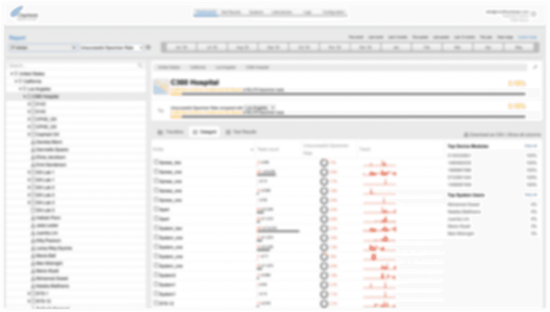
Before: home "dashboard"
Overwhelming displays of mixed data (intentionally obscured here to protect data) and unconventional interaction and UI patterns confronted users with undue cognitive burden.
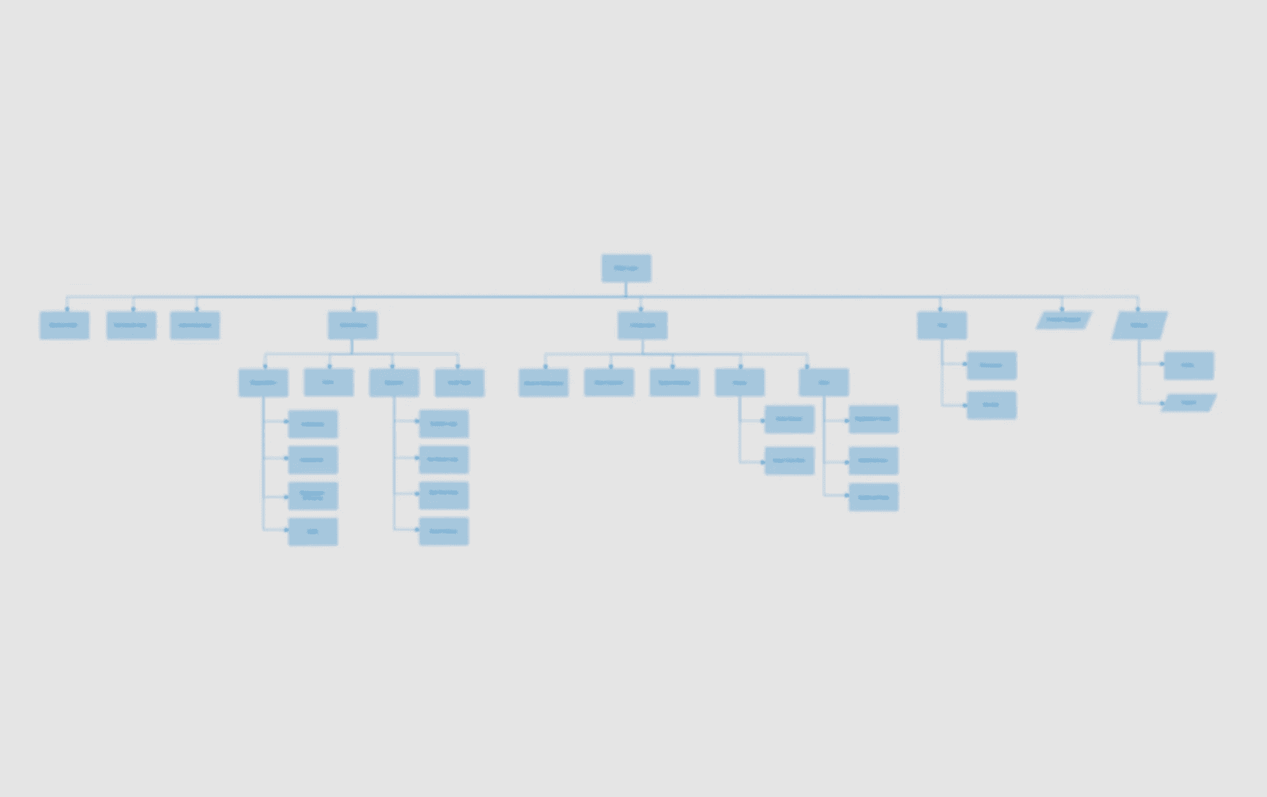
This spurred us to reconsider the information architecture from the ground up, mapping and assessing everything from the site's primary navigation to sub-sections to section labels.
Information & product strategy
Throughout the process, we never approached design in a vacuum. Product and engineering teams were critical stakeholders in every decision.
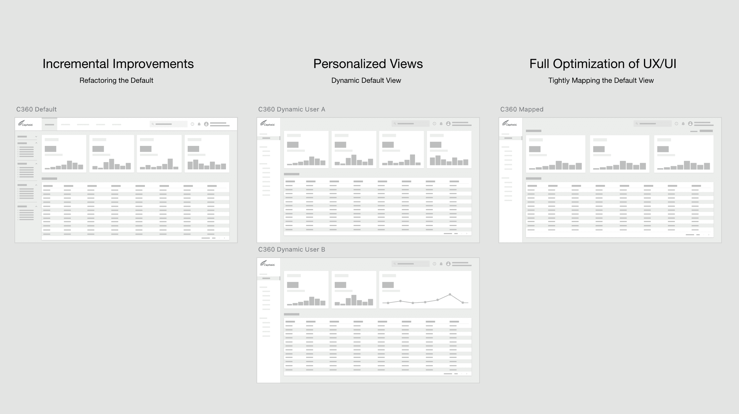
Even our earliest concepts were developed with these viewpoints in mind. For example, how we might release a best-in-class experience in one go versus in incremental releases, or how one solution might impact development timelines and resourcing over another.
Towards a workflow-first architecture
We needed to increase adoption while advancing the product roadmap, including considering differentiated tiered offerings. In order to achieve this, we needed to move away from simple troubleshooting into delivering robust clinical insights.
We needed more insight into our end-users.
Leveraging a network of lab managers, clinicians, and subject matter experts, we identified a unique value proposition: the relationship between device health and data reliability. If a GeneXpert module is failing, test results from that instrument become questionable. This was a critical insight that needed to drive the entire architecture.
Shaping insights
With this value proposition defined, we worked with end users to identify which specific metrics would enable them to catch device issues before they impacted patient care.
This emphasized that we needed to:
Prioritize data with the highest clinical utility
Surface device health prominently
Eliminate low-value legacy features
Key Trade-offs
Not every decision was straightforward.
One recurring theme was feature load vs. cognitive clarity. Internal stakeholders were initially reluctant to let go of any legacy features, arguing, "users might still need this." Through testing, I demonstrated that the value of clarity of the generated higher perceived value of the product. I advocated for cutting low-utility features entirely, which met resistance but proved correct in validation sessions.
Another challenge was development speed vs. design ambition. With limited engineering resources, I had to choose between a phased rollout with incremental improvements or a "big bang" redesign. We were able to find a happy medium through a streamlined handoff system I created with page templates, in addition to working together in rapid design sprint cycles.
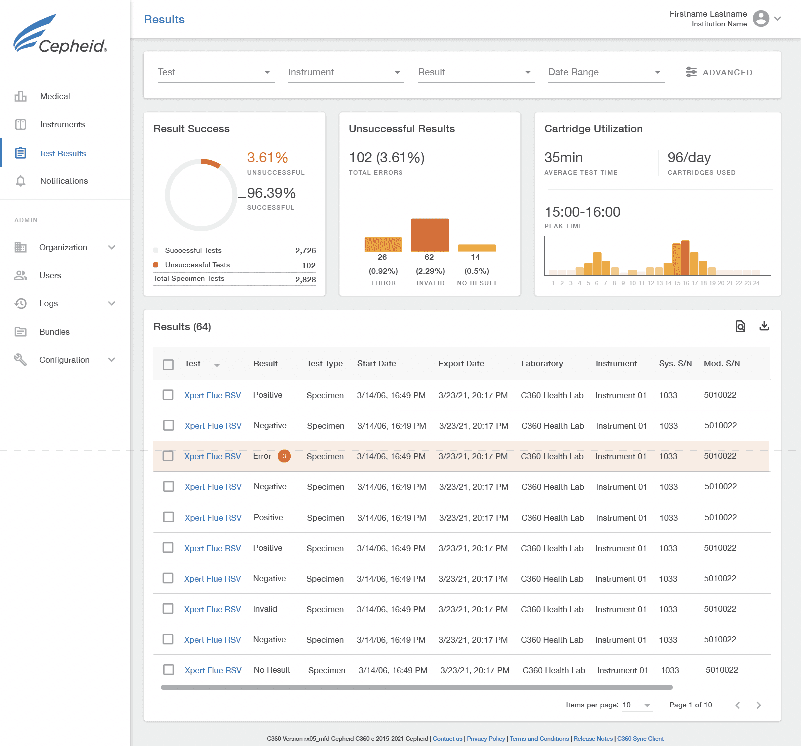
After: test results view
We didn't just redesign screens. We redesigned the hierarchy of urgency.
Visual hierarchy, spacing, and contrast were used to guide attention toward the most time-sensitive information first. Color and emphasis were applied with constraint to avoid alert fatigue and help clinicians scan confidently under pressure.
Users now have high-level overview where the most actionable and insightful data points are prioritized.
After: device view
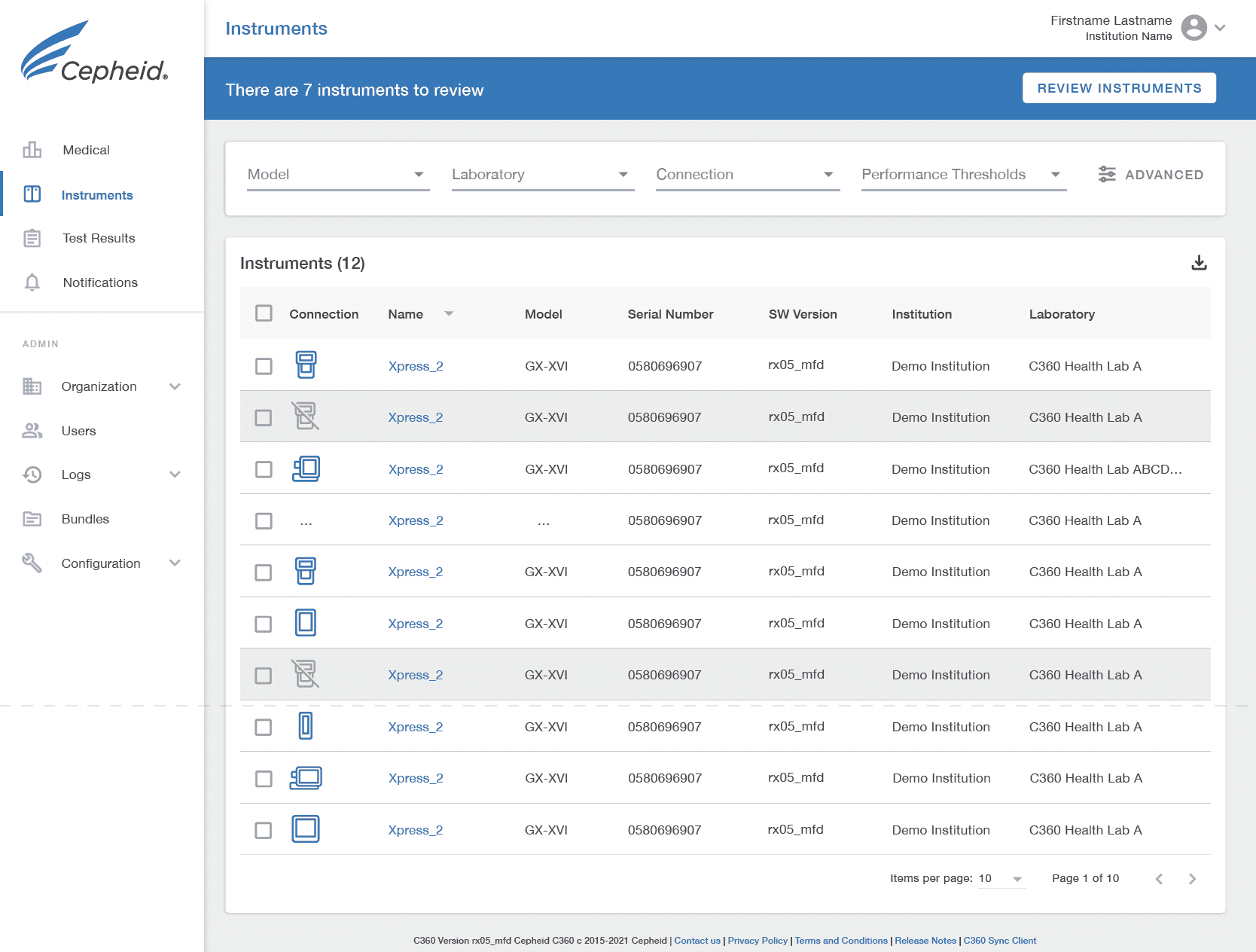
Site data tables and filtering tools were cleaned up, standardized, and templatized for the development team. Certain views, like Instruments, leveraged in-table icons to layer additional information into a snapshot view.
A total transformation
Today, Cepheid's C360 software connects GeneXpert diagnostic systems across healthcare networks, aggregating instrument performance data and test results. For lab managers and infection control teams, it's their early warning system, helping to catch maintenance issues before devices fail and to track disease trends across facilities.
Through strategic architecture and workflow-first thinking, we transformed a cluttered "Swiss Army knife" into a precision instrument that adapts to clinical needs rather than demanding clinicians adapt to it.
The redesigned dashboard prioritized high-impact metrics in clinician workflows, improving confidence and reducing cognitive load. The solution supported faster insight discovery, anecdotally confirmed in usability observations. We also established new patterns and page templates that sped up development in sprint cycles and standardized future builds.
From our Product Lead
"Allie is an outstanding Designer, teammate, and role model. I had the pleasure of working with her when I was working to foster a rapid prototyping culture at Cepheid. I was the Product Operations Manager at Cepheid, and Allie was a Lead Designer for the design agency (Mindfow Design—now MPE) working with us.
Every two weeks, Allie prototyped an idea, starting with stakeholder and customer interviews and finishing with a customer/user-validated prototype. She set the pace and never waivered. She is a credit to her profession. I was delighted to have her on my team. I highly recommend her and hope one day to have the opportunity to work with her again."
—Brad Black

